
Tuesday, 29 September 2015


Monday, 28 September 2015
Research: Magazine Cover Analysis #3
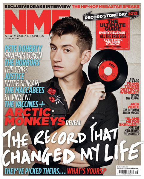 The image relates to the headline as it shows the singer of Arctic Monkeys, Alex Turner and takes up quite a lot of the cover, and has his head tilted but is looking directly into the camera. The photograph has been manipulated to be more sharp and clear. The only part of the image that is covered by the writing is the main story "The record that changed my life". The background is clear and looks as tough had been taken in a studio. The image is in colour. Alex Turner is wearing a black shirt with a red rose on, which coordinates with the black and red shown on the cover, this represents the genre of indie as it is very casual, which links into the models hair which is messy and laid back which is similar to indie music. There is a prop of an old record, which links into the main cover story. I feel this magazine follows conventions of indie genre music magazine, as it is simple, relaxed, and casual.
The masthead is located on the top left corner "NME" which is a British music magazine and is written in red and is San serif. The masthead only covers a small area of the magazine cover.
I would use this similar style as I do not want my masthead to overpower the cover. There are 6 cover stories on this front cover and to some may be seen as cluttered. The font is very similar throughout, however the sizes and the colours change to show separation. The main cover stories which links into the image "The record that changed my life" is written in a slightly different font which is messy and rough around the edges which signify the band themselves and represents the genre of indie through this font. There is also text on a banner on a the right top corner with a puff inside promoting features inside the magazine. The main colour scheme is red and grey, I think red may be the house style for NME as the masthead is red, repeated use of the colour red as a masthead allows me to refer to it as the house style. I think this magazine is intended to have a target audience of both male and female teenagers, as indie genre is wildly liked. The pug on this magazine is the angled shape with "Record Store Day 2012" this gives the reader an incentive to open the magazine. The sell line is located at the top of the magazine and uses a buzz word "Exclusive" to catch the readers attention. The most outstanding feature of the cover is the artist, Alex Turner and the white headline. The front cover connotes the magazines quality as it is edgy but clear, and has a very high quality image so suggests a higher price. I particularly like the simplicity and the house style of this cover and the messy but organised layout.
How this has influenced my creativity and ideas:
I love the coordination of the colours of red and black throughout the whole cover, and how it links in with the prop. This research has also made me consider the use of a crop as it adds more authenticity. I think the puff is extremely effective on this cover and I feel this is due too the overlap of the black on a red. I will definitely use two clashing colours on my puff on my magazine cover.
Research: Magazine cover analysis #2

The masthead is located across the top of the magazine and takes up one fifth of the cover, "vibe" which is an American magazine. The magazine has six cover stories and is presented in a skyline, the fonts of each remain the same however the font size seems to change on level of importance that is recommended to the reader. For example the bold font used on "WHY IS DRAKE SO ANGRY?" emphasises on who the story line about.This image relates to the headline of "Nicki Minaj" as it is the artist and fills a lot of the page. Nicki is looking directly into the camera and is a medium shot with her hands on her hips. The photograph has been manipulated as the make up has been enhanced and the colours are now brighter, sharper and clear. The image is only covered by text that are sell lines on the right of the cover, also the barcode slightly covers the artists right wrist, but overall the image of the artist is the main feature as it even overlaps the masthead and makes it slightly unreadable. The background is plain white and doesn't distract the reader from the artist, and appears to be taken in a studio, also suggesting that this is a fairly up market magazine.
There is also text on a banner on the left saying "vibe" and on the right saying "13". There is a puff of "ways to dress like a man.." this is a promotion/advice for the reader. The image is colourful and the main noticeable colour is orange, which represents happiness, creativity and success, to the human eye orange is a very hot colour so therefore this may insinuate to the reader that this magazine is the "hottest" perhaps "freshest" magazine to be reading. Nicki Minaj is wearing a sophisticated and glamorous top/dress, with sparkly jewellery and a prop of a crown. This again implies success and determination as an independent woman, which links into the sub headline/ teaser line of "Notorious King" suggesting irony as she is clearly an attractive female and should be referred to as "Queen" but yet her stance and pose implies attitude and fierceness from the female artist. The young modern representation of a woman,with glamorous hair and make up is to attract the target audience of teenage girls who aspire to be as independent as she is. This music magazine follows conventions as magazines with a target audience of teenage girls are likely to have a glamorous hair and make up and be presented with a independent female artist. The main element I like about this magazine is the use of the colour orange on the cover as it is very eye catching, as it is the most outstanding feature as it links into the masthead which is conventional and is serif. The front cover connotes the quality of the magazine as it is very high quality image with a sophisticated layout and fonts.
How this influenced my creativity and ideas:
I love the use of orange and white and the contrast, which in my eyes makes it look simple and elegant. I will therefore only use a maximum of three colours on my magazine cover to help connote the same quality.
Thursday, 24 September 2015
Evaluation of Key Skills
In a very short period of time I have learnt and increased my creativity in Media more than I would have expected. I have previously posted a blog on "useful technology tips learnt in lesson" and since then i have learnt lots more.
Previous to beginning AS Media, I had very little knowledge of Apple mac computers as I had never been one, however now I have learnt lots of short cuts and how to do screen grabs of specific areas on the monitor. I had also never had a Blog before and never understood the concept however i have gotten to grips with it very quickly and enjoy it.
I also had very little knowledge on photography and had never taken into consideration the lighting or the background and was unaware of all the different shot types. the photography then led to using a memory card reader and extracting a memory card independently which are all skills I didnt have prior to Media.
Using a photo manipulating software such as Adobe for the first time has allowed me to prepare and build skills for when I create my music magazine cover. I learnt skills such as how to create shapes to present as pugs on a magazine cover. Also how to edit images from online so the background is erased using the magic rubber tool.
I have also learnt the usefulness and importance of saving a file as a jpeg and not a pdf.
All these skills will help me to develop my creativity and independence for creating my music magazine cover.
Research: Applying Genre Theory

I know this is Pop genre instantly due to many things the producers have done. For example the pinks an purples are very feminine and attract the target audience or teenage girls. The magazine is very bright and colourful. The image is always a recent pop singer who teenage girls like to listen to and in this case is Jessie J. The sell lines are often topics teenage girls would be interested in and go straight to the point.
The genre theorist Hodge and Kress believe genre controls the behaviours of producers of such texts so the expectations are met of potential consumers. I agree with this theory, as a teenage girl would not expect to see dark and dull colours when buying a pop magazine, so therefore the producers comprehend that and therefore stick to the conventions of Pop being cheerful and feminine.
This research has influenced my planning for when I create my own magazine cover as when I chose a genre I will do further research into that genre and learn the codes and conventions, this will influence my creativity of my music magazine cover.
Evaluation: Preliminary Task

My annotation of my front cover is not clear on the image so I will therefore state them again in this post so it is more clear.
The colours I have used are inspired from the College logo, which is dark blue. However to attract the attention of the reader I used brighter colours such as reds, purples and oranges. The background is blue and the students top is also blue.
The Masthead is located on the left top corner and then spreads across. I chose to enlarge the "V" and the "6" to suit the layout of the cover. I did this by using different text boxes for the text I wanted to be bigger, the font I used was "Silom" and was san serif as I wanted the cover to look very professional and intellectual. Beneath the masthead underneath "ale" is the college logo which I edited using the magic rubber tool on adobe so I got the desired effect.
The image I used was a medium close up shot of a student who has eye contact with the camera and has the indexical sign of a pen in her hand, and is dressed smart which helps present an organised sixth form student.
The cover stories I used, was in brighter colours to help attract attention and were based on educational information, e.g applying for University and study tips. In the cover stories i used buzz words, such as "exclusive" and "latest", I also used direct address to help attract the reader, by saying .."right for you!"
My end magazine cover is very similar to my plan, however originally I did want the student to be left of frame, but I changed my mind due to the student looking as though she had been chopped off.
If I were to do it again I would take the image of my student outside in natural light as it looks more professional and I would also locate the barcode in the bottom right corner so it wouldn't interfere with the masthead, as now the "6" is located lower down as I would have hoped.
I will learn from my mistakes and allow that to influence me in creating my music magazine cover.
Finished College Magazine

This is my completed magazine cover. I have annotated the cover, handwritten and will be posting that in a new blog. I used Adobe Photoshop Elements Editor to create this cover. This software was very useful for adding the texts, the creative shapes and editing images.
Tuesday, 22 September 2015

Thursday, 17 September 2015
Planning: Selection of Images

I chose to use this image as one of my selection images due to the natural bright lighting making the image seem to have netter quality. Also the student is looking directly into the camera. However the only problem is that it is a medium shot, so to make it medium close up shot i shall be cropping it slightly. Also in all of these images is the iconic stereotypical items of a student, which is a pen and paper which helps give the cover the student effect i desired.

I made a mistake by taking this image landscape however if i chose to use this i will crop to make it be seen as portait. However when cropping i will still ensure that the student is left of frame as that is how i want my magazine cover to be presented.

I chose this image for similar reasons i chose the first image, such as the direct eye contact with the camera and the crops. However this one has slightly less good lighting and has a noticable border on the wall behind which may distract the viewer slightly.
Planning: Rejection of Images


This image is a medium shot and not a medium close up shot so I would therefore have to crop this image. Also there is too much background area behind her.

The natural lighting is better in this photo however the students eyes are shut so therefore, it is an automatic rejection.
Plan for Front Cover and Contents Page

Magazine Cover
My magazine cover consists of very bright noticeable colours, and contain buzzwords such as "exclusive" and "new". The barcode is located on the rights of the cover, and the release date is located on the left corner. The student will be located left of frae and will be a medium close up shot.

Contents Page
My contents page is similar to lots of other contents pages as it contains both images and text.
Tuesday, 15 September 2015
Planning: Building knowledge on Genre
My favourite types of Genre has a range from Horrors, to Comedy, to Romance.
Genre is established through codes and conventions. Code gives meaning, but a code only becomes a convention when it is repeatedly used.
Terminology:
Sub genre; two genres together, for example Romantic Comedies.
Hyrbidity; a mix of Genres.
Genre Theorists:
Hodge & Kress 1988; defines typical forms of texts which link kinds of producer, consumer, topic, medium, manner and occasion. Genre controls the behaviours of producers of such texts so the expectations are met of potential consumers.
Steve Neale 1990; Hollywood generic themes are too meet the audiences meanings and pleasure and also argues that pleasure is derived from "repetition" and "difference".
When creating my magazine cover I shall pick a Genre and then do research into its history to help develop my magazine cover further. Researching into different Music magazines will allow me to get inspiration for when I create my own magazine cover. I shall do another post applying genre theory as i now have the knowledge.
Useful technology tips learnt in Lesson
In recent lessons i learnt useful tips on how to use the macs.
"Cmd + Shift + 4" allows you to take a targeted Screenshot, in which you only capture in what you like and which is very time effective.
"Cmd + C" allows you to Copy and "Cmd + V" allows you to Paste. This short cut is also very time effective and makes copying and pasting perhaps text or an image much simpler.
Another tip I learnt was how to embed a hyper link on to your blog. This can be done by witching from "compose" to "HTML" and then using the share link that is provided to copy that in.
I find all of these tips very informative and handy as I am beginning to build up my skills using technology, so therefore when it comes to presenting my Magazine cover I will be more capable.
Further Plan for Magazine Cover Photo Shoot

This shirt from River Island is what I would ideally like my Sixth Form Student to be wearing as it is smart, casual and sophisticated, and gives the perfect impression of Sixth Form life. Also using an outfit like this for a Sixth Form magazine cover reminds all the student audience that simplicity is key.
Friday, 11 September 2015
Planning : Photography for Magazine Cover
My plan for my image on the magazine cover is to have the student left of frame therefore I can allow writing and buzz words to be displayed on the right of the magazine cover. The shot will be a medium close up shot, therefore it is simple but however shows enough of the student, such as their clothes and what their holding.
I would prefer my student to be wearing a smart casual outfit, such as a buttoned up shirt with jeans, therefore this implies that the student has the right motivation to learn but can also do it comfortably. the props I will bring for them to hold will be a pen and a notepad, and I shall have them with their body language facing towards the book s writing, however the eyes towards the camera. I feel this will be effective as it will show the student actually working.
The background of the photo shall be kept very muted and understated so therefore the focus will not be taken off the student, and will also not imply that the student has distractions around them whilst working.
Thursday, 10 September 2015
Research :Magazine Cover #1: Q Cee-Lo
When choosing a Q Magazine cover, this one in particularly caught my eye and I believe this is due to the how fierce the cover is. Cee Lo directly looks into the camera with anger and uses a fist gesture which can be seen as threatening, however the pink font contrasts that representation hugely and allows you to see the cover differently, a pink is symbolic for being feminine and girly.
The masthead is the large "Q" in the top left corner in white with a red background, and is always situated in that are and becomes iconic for the company. The clear background emphasises that the artist wearing contrasting colours to the scenery is the main and only focus. The barcode is located in the bottom left corner as therefore it wont detract from the front cover.
The first noticeable colour when seeing this cover is black, which is symbolic and also polysemous, as it can present different interpretations and connotations. The front cover also has indexical signs which help create Cee Lo's image, for example the armour signifies being strong and tough, the sunglasses present an image of being cool and relaxed, which contrasts to the heavy armour over his shoulders and the jewellery implies that he is modern and edgy. Therefore overall you are presented with a fierce, yet easy going, and modern artist, which is Cee Lo Green.

Initial Response to AS Brief
Eager to begin. I love building skills, being creative and getting to present in the way I wish. This task excites me as it is a new experience and I already have a vision of what I want.
OCR G321 Print Brief
Preliminary exercise: using DPT and an image manipulation program, produce the front page of a new school/college magazine, featuring a photograph of a student in medium close-up plus some appropriately laid-out text and a masthead. Additionally candidates must produce a DTP mock-up of the layout of the contents page to demonstrate their grasp of the program.
Main task: the front page, contents and double page spread of a new music magazine.
Main task: the front page, contents and double page spread of a new music magazine.
Subscribe to:
Comments (Atom)