 The image relates to the headline as it shows the singer of Arctic Monkeys, Alex Turner and takes up quite a lot of the cover, and has his head tilted but is looking directly into the camera. The photograph has been manipulated to be more sharp and clear. The only part of the image that is covered by the writing is the main story "The record that changed my life". The background is clear and looks as tough had been taken in a studio. The image is in colour. Alex Turner is wearing a black shirt with a red rose on, which coordinates with the black and red shown on the cover, this represents the genre of indie as it is very casual, which links into the models hair which is messy and laid back which is similar to indie music. There is a prop of an old record, which links into the main cover story. I feel this magazine follows conventions of indie genre music magazine, as it is simple, relaxed, and casual.
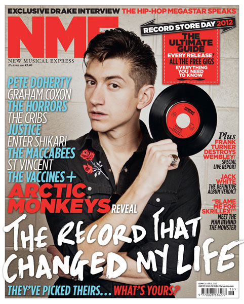
The masthead is located on the top left corner "NME" which is a British music magazine and is written in red and is San serif. The masthead only covers a small area of the magazine cover.
I would use this similar style as I do not want my masthead to overpower the cover. There are 6 cover stories on this front cover and to some may be seen as cluttered. The font is very similar throughout, however the sizes and the colours change to show separation. The main cover stories which links into the image "The record that changed my life" is written in a slightly different font which is messy and rough around the edges which signify the band themselves and represents the genre of indie through this font. There is also text on a banner on a the right top corner with a puff inside promoting features inside the magazine. The main colour scheme is red and grey, I think red may be the house style for NME as the masthead is red, repeated use of the colour red as a masthead allows me to refer to it as the house style. I think this magazine is intended to have a target audience of both male and female teenagers, as indie genre is wildly liked. The pug on this magazine is the angled shape with "Record Store Day 2012" this gives the reader an incentive to open the magazine. The sell line is located at the top of the magazine and uses a buzz word "Exclusive" to catch the readers attention. The most outstanding feature of the cover is the artist, Alex Turner and the white headline. The front cover connotes the magazines quality as it is edgy but clear, and has a very high quality image so suggests a higher price. I particularly like the simplicity and the house style of this cover and the messy but organised layout.
How this has influenced my creativity and ideas:
I love the coordination of the colours of red and black throughout the whole cover, and how it links in with the prop. This research has also made me consider the use of a crop as it adds more authenticity. I think the puff is extremely effective on this cover and I feel this is due too the overlap of the black on a red. I will definitely use two clashing colours on my puff on my magazine cover.
You need to insert paragraphs and highlight key terminology. Also, add to this how this research has influenced your ideas and creativity.
ReplyDelete